


CSS100Day(13)-图片hover上方出现蒙层和元素
1180 字
6 分钟
CSS100Day(13)-图片hover上方出现蒙层和元素
设计简介
本次练习主要实现常规图片hover时显示蒙层以及一个+号按钮,点击后使用过渡显示卡片:
-
关键点1:hover时蒙层的opacity设置为0.5而不是1
-
关键点2:在过渡效果中,可以设置多个transition,.active的transition是进入过渡,设置在元素上的transition是退出过渡
效果展示


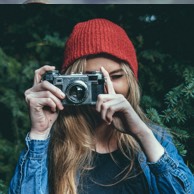
邓岳林
实现代码和步骤
HTML部分
HTML部分如下
<div class="frame"> <div id="profile-1" class="profile"> <img src="https://100dayscss.com/codepen/13-1.jpg" alt="" /> <div class="overlay"></div> <div class="plus"></div> </div> <div id="profile-2" class="profile"> <img src="https://100dayscss.com/codepen/13-2.jpg" alt="" /> <div class="overlay"></div> <div class="plus"></div> </div> <div id="profile-3" class="profile"> <img src="https://100dayscss.com/codepen/13-3.jpg" alt="" /> <div class="overlay"></div> <div class="plus"></div> </div> <div id="profile-4" class="profile"> <img src="https://100dayscss.com/codepen/13-4.jpg" alt="" /> <div class="overlay"></div> <div class="plus"></div> </div> <div id="detail-1" class="detail"> <div class="close"></div> <img class="header" src="https://100dayscss.com/codepen/13-1-header.jpg" alt="" /> <div class="image"> <img src="https://100dayscss.com/codepen/13-1.jpg" alt="" /> </div> <div class="infos"> <div class="name">邓岳林</div> </div> </div></div><script> const profile = document.querySelectorAll(".profile") const detail = document.querySelector(".detail") const closeEle = document.querySelector(".close") profile.forEach((n) => { n.addEventListener("click", () => { detail.classList.add("active") }) }) closeEle.addEventListener("click", () => { detail.classList.remove("active") })</script>CSS部分
注意2个关键点即可
:root { --red-color: #ec6565;}
.frame { position: relative; width: 400px; height: 400px; box-shadow: 1px 2px 10px 0 rgba(0, 0, 0, 0.3); background: #fff; color: #fff; display: grid; grid-template-columns: 1fr 1fr; grid-template-rows: 1fr 1fr;}
.profile { position: relative; display: grid; place-content: center; cursor: pointer; z-index: 0;
img { width: 100%; height: 100%; }
.overlay { position: absolute; inset: 2px; background: #000; opacity: 0; transition: all 0.6s ease-in-out; }
.plus { position: absolute; inset: 0; margin: auto; border-radius: 50%; width: 50px; height: 50px; background: var(--red-color); box-shadow: 2px 4px 10px 0 rgba(0, 0, 0, 0.5); transition: all 0.4s ease-in-out; opacity: 0; transform: scale(2); pointer-events: none;
&::before { display: block; content: ""; width: 14px; height: 2px; background: #fff; position: absolute; inset: 0; margin: auto; }
&::after { display: block; content: ""; width: 2px; height: 14px; background: #fff; position: absolute; inset: 0; margin: auto; } }
&:hover { .overlay { opacity: 0.4; } .plus { opacity: 1; transform: scale(1); } }}
.detail { display: block; position: absolute; inset: 0; overflow: hidden; pointer-events: none; font-size: 0; z-index: 2;
.header { transform: translateY(-105%); transition: all 0.6s ease-in 0.4s; height: 200px; z-index: 2;
img { width: 100%; height: 100%; } }
.image { box-sizing: border-box; position: absolute; z-index: 3; top: 150px; left: 150px; width: 100px; height: 100px; border: 2px solid #fff; border-radius: 50%; overflow: hidden; box-shadow: 4px 6px 15px 0 rgba(0, 0, 0, 0.2); transform: translate3d(0, -250px, 0); transition: all 0.6s ease-in 0.4s;
img { width: 100%; height: auto; } }
.close { z-index: 2; width: 50px; height: 50px; background: var(--red-color); position: absolute; right: 10px; top: 10px; border-radius: 50%; cursor: pointer; transform: translateY(-130%) rotate(45deg); transition: background 0.3s ease-in-out, transform 0.5s ease-in;
&:before { position: absolute; content: ""; width: 14px; height: 2px; top: 24px; left: 18px; background: #fff; transition: all 0.3s ease-in-out; }
&:after { position: absolute; content: ""; width: 2px; height: 14px; top: 18px; left: 24px; background: #fff; transition: all 0.3s ease-in-out; }
&:hover { background: #fff; &::after, &::before { background: var(--red-color); } } }
.infos { box-sizing: border-box; background: var(--red-color); height: 220px; padding-top: 67px; transform: translate3d(0, 130%, 0); transition: all 0.6s ease-in 0.4s; }
.name { font-size: 16px; font-weight: 600; text-align: center; }
&.active { pointer-events: all;
.header { transform: translateY(0); transition: all 0.6s ease-in 0.2s; }
.image { transform: translate3d(0, 0, 0); transition: all 0.6s ease-in 0.4s; }
.close { transform: translateY(0) rotate(45deg); transition: transform 0.6s ease-in 0.8s; }
.infos { transform: translate3d(0, 0, 0); transition: all 0.6s ease-out 0.2s; } }}分享给其他人
如果该文章对您有帮助,欢迎分享给其他人阅读!
复制链接
相关文章
推荐筛选
1
CSS100Day(18)-3D实现弹性元素
设计灵感 3D实现弹性元素
2
CSS100Day(12)-hover出Tooltip技巧
设计灵感 巧妙使用隐藏伪元素解决缝隙hover效果丢失问题
3
CSS100Day(7)-菜单列表和公告在一起
设计灵感 菜单隐藏在后面,利用transform的translateX点击移动展开
4
CSS100Day(16)-利用before、after伪元素完成长方形散花动画
设计灵感 伪元素实现长方形散花动画
5
CSS100Day(9)-纯元素制作雨滴下到地面
设计灵感 利用animation的scaleX、scaleY制作雨滴下落到地面散开效果
随机文章
随机推荐